Smarttec Brand Guidelines
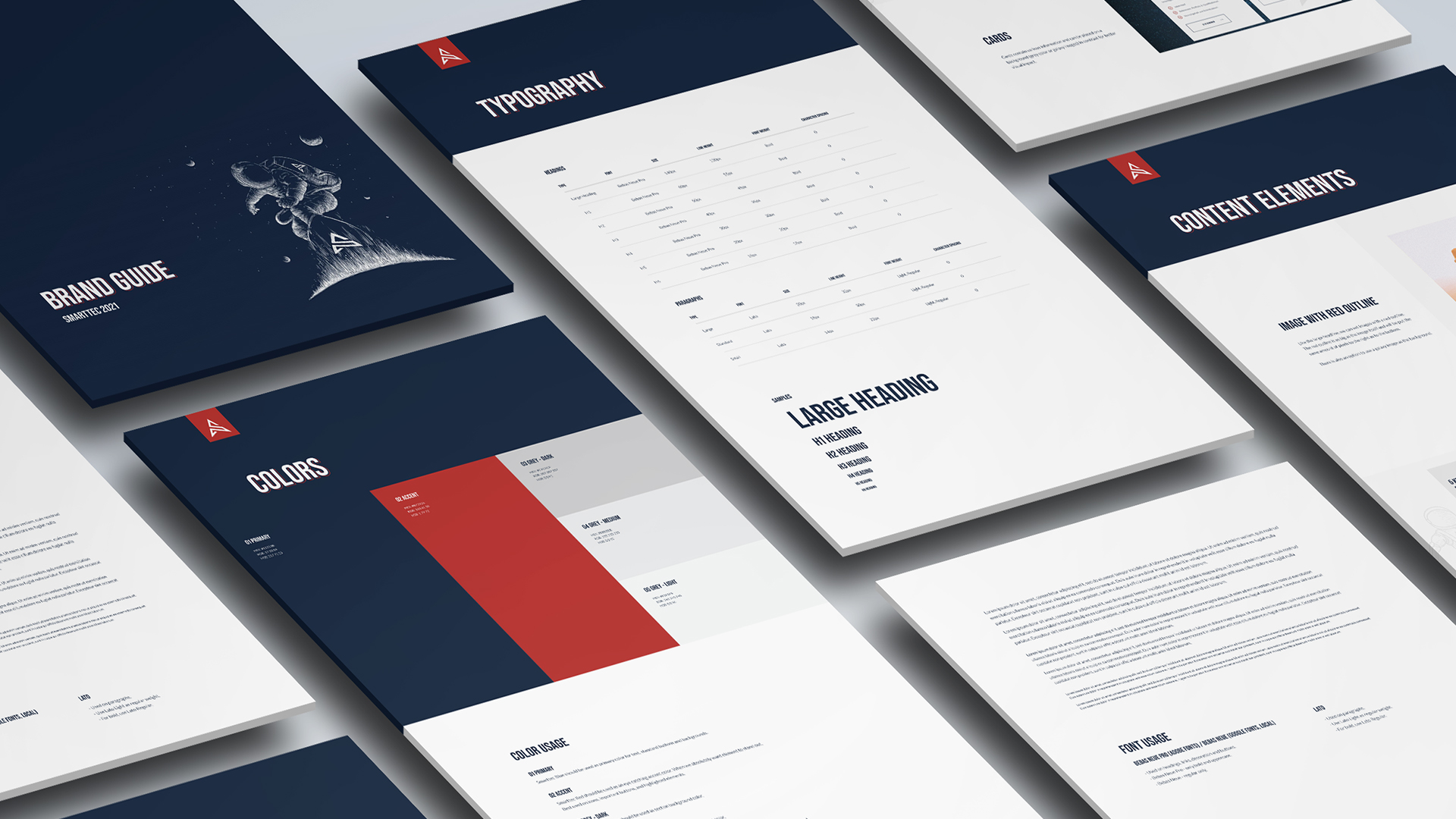
Brand guidelines for a digital agency providing design, web development and online marketing services.
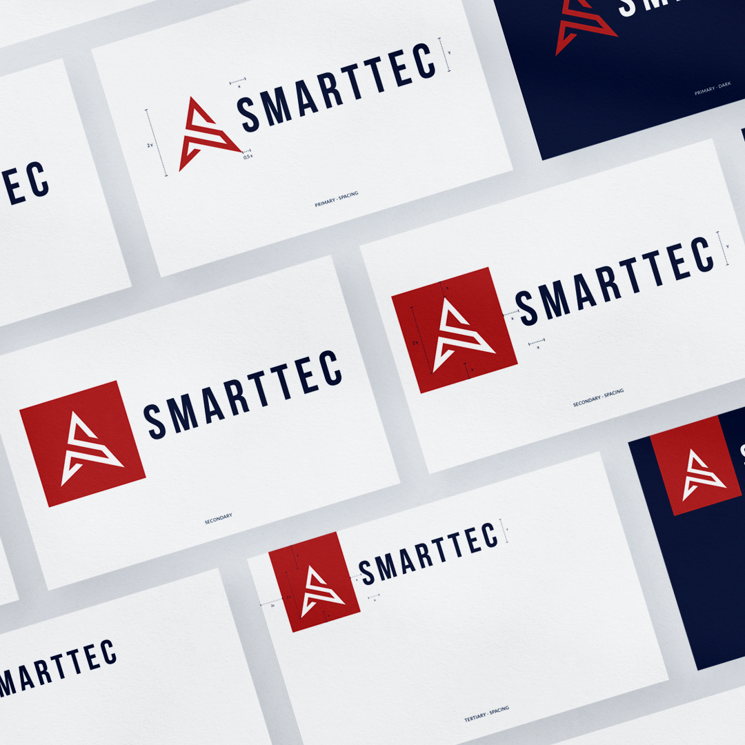
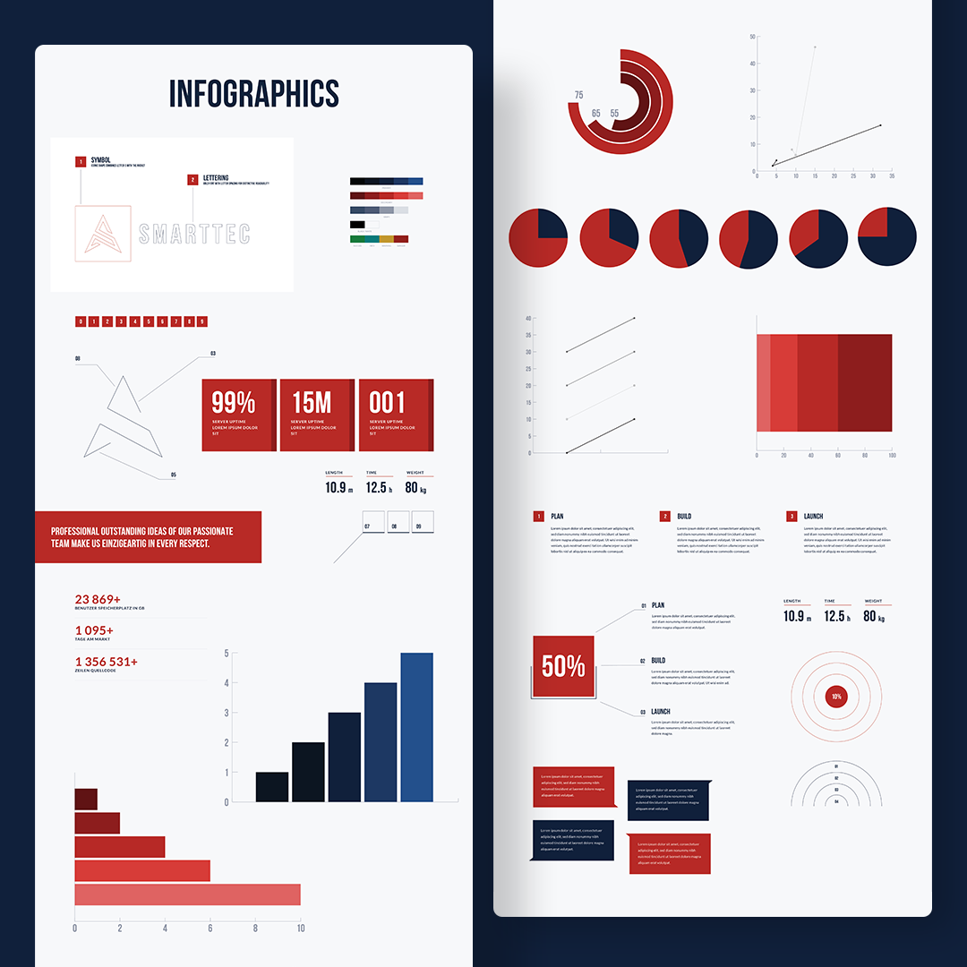
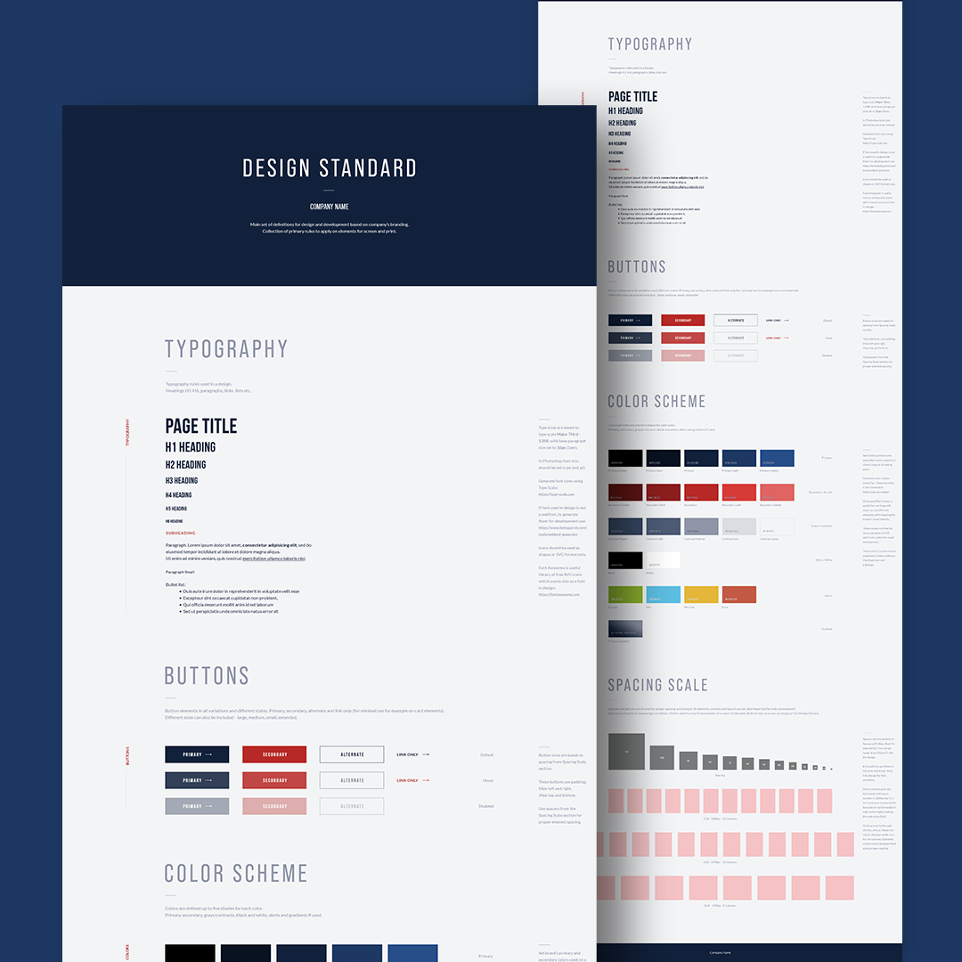
In creating the brand guidelines for this digital agency, I focused on establishing a consistent visual language that would be easily identifiable across all mediums. This includes typography, color palette, and spacing scale. By defining these visual elements, the agency can maintain a cohesive look and feel, no matter what type of content they create.
In addition to the visual definitions, the brand guidelines also include information on how to use these elements effectively. For example, guidance on how to use typography in different contexts, such as headlines, body text, and captions. Also included are instructions for how to use the color palette - primary colors and any secondary or accent colors that may be used.
Furthermore, I designed the brand guidelines with both digital and print in mind, to ensure that the brand always looks amazing and consistent across all mediums. This means that the guidelines provide information on how to use the visual elements in a variety of digital contexts, such as social media posts, website design, and email campaigns. They also provide information on how to use the visual elements in print, such as business cards, brochures, and other marketing collateral.
Overall, these brand guidelines serve as a guide for anyone creating content on behalf of the brand. They ensure that the agency's brand identity remains consistent, while also allowing for creative flexibility within that framework.
