Smarttec Website
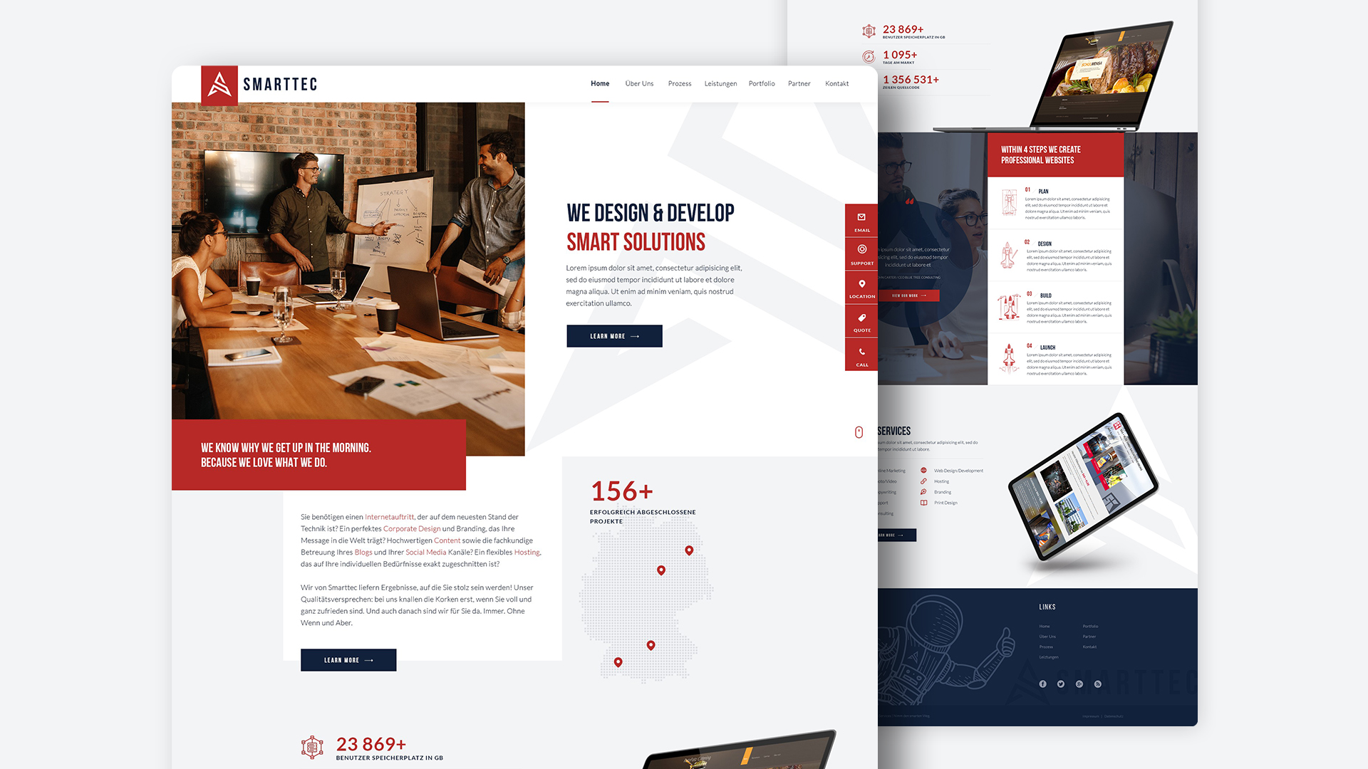
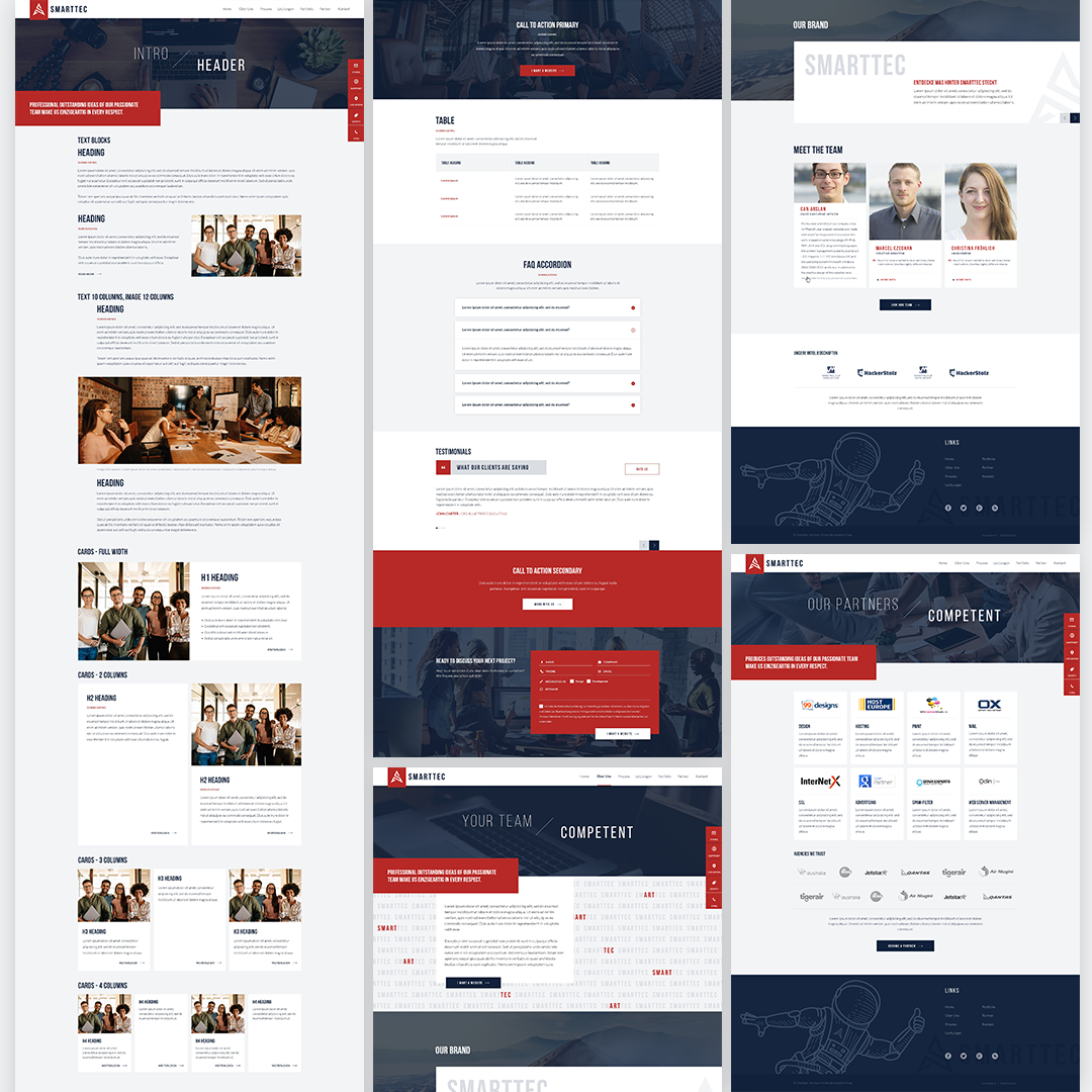
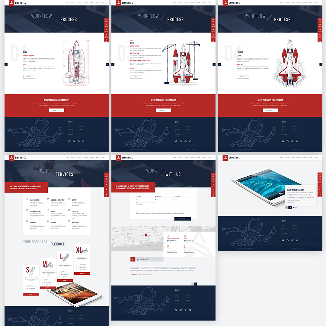
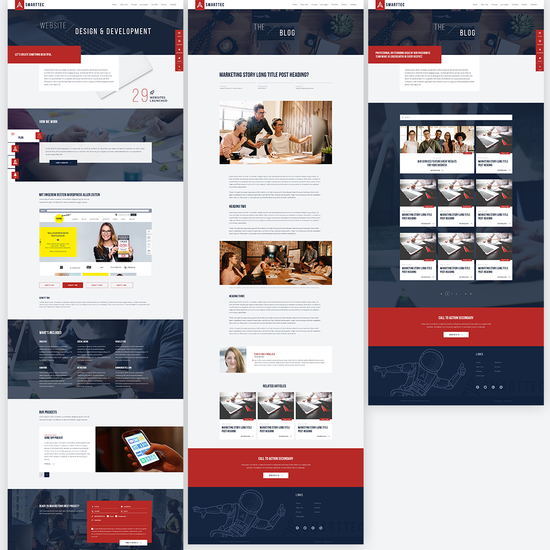
This one was huuuuge! One of the biggest projects I've been working on and all together created by multiple designers. Website design for agency I've worked for years — digital agency for design, web development and online marketing services.
Many pages, elements, details and visual connections to keep in mind for the best possible usability and readibility. All of this while keeping it consistent with the brand style and creating design system for the web, based on brand guidelines I created previously for print.
Everything from typography defined with type scale;
colors set using deep learning — brand colors, grays and semantics;
to spacing and sizing using 8-point grid system;
across whole website, everything was carefully crafted with attention to detail to make it consistent and scalable.
