Enercy Logo

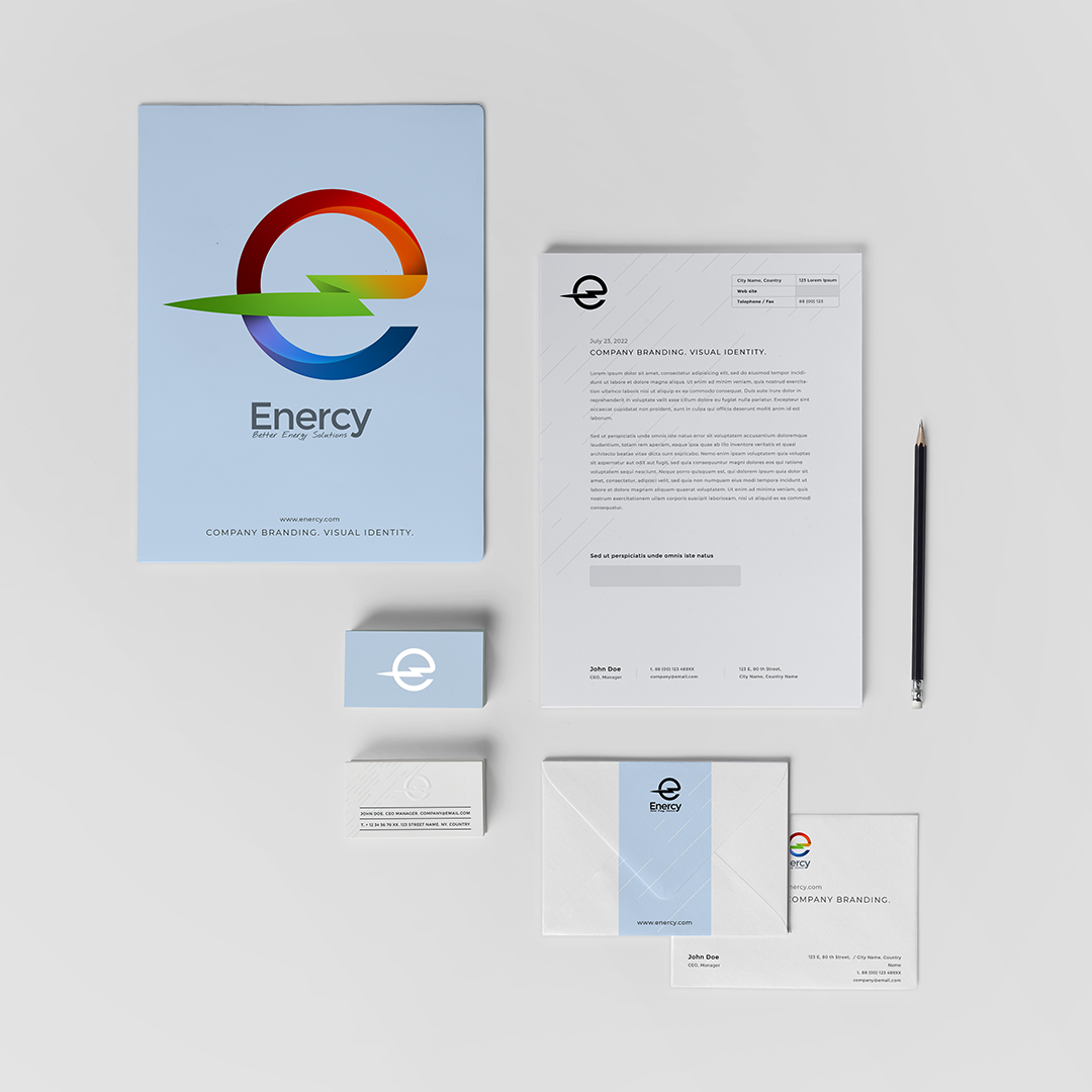
Branding of the energy efficient heating systems company.
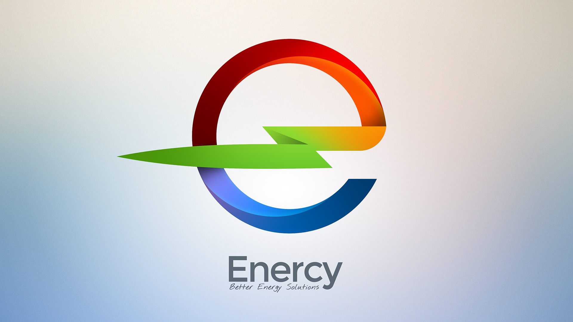
The logo for "Enercy", an energy-efficient heating systems company, features a stylized letter "e" as its mark. The letter is designed with a gradient of colors that represent the cycle of energy that flows through the heating system. The top part of the "e" is colored in red, representing heat and fire, while the bottom part of the letter is colored in blue, representing water and cooling. The two colors come together in the middle of the "e," which is colored in green, representing the clean energy output that the company's system provides.
The goal was that the logo creates a visually impactful impression that is sure to make a bold statement for the startup, especially when presenting to potential investors. The gradient of colors used in the design not only catches the eye but also effectively communicates the concept of energy flow and the clean energy output that the company offers.


