

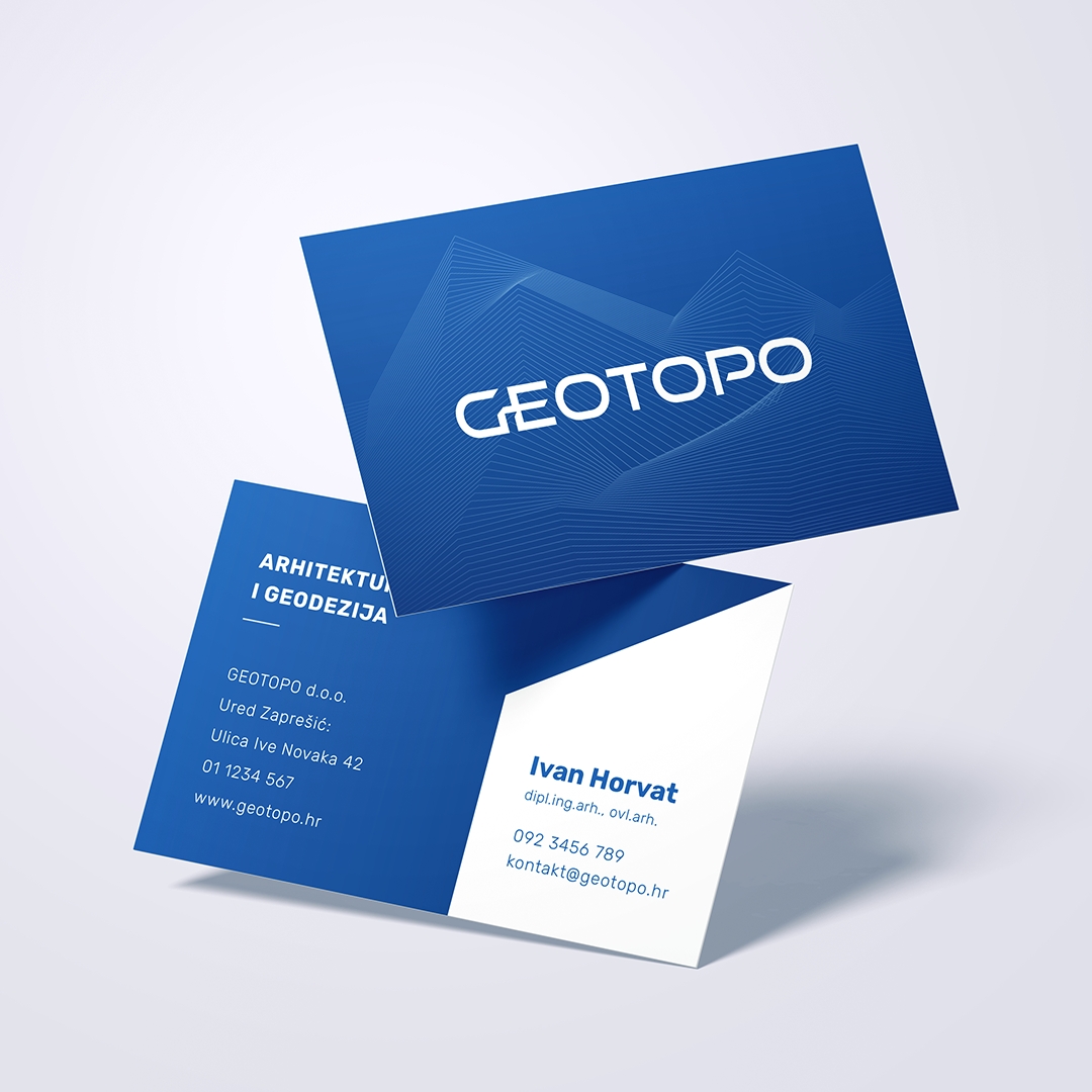
Geotopo Logo
The Geotopo logo, a modern and stylized redesign that represents the geodesy and architecture services provided by the company.
The logo is composed of the company name in bold and contemporary typography, which has been customized to create a unique and memorable brand identity. The "GE" in the name Geotopo is stylized in a minimalist way that catches the eye and adds a touch of modernity to the logo design.
The visual identity consists of a carefully crafted color palette, typography, sizing, and spacing scale as an improvement of the company's already existing branding. They have been carefully chosen for the consistency across all media, including display, web, and print.
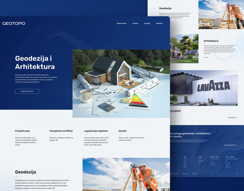
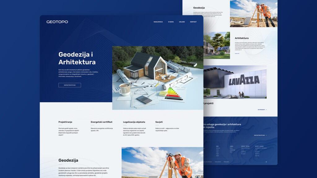
Geotopo got a complete refresh with the new branding, logo, print material designs and a website. The goal was achieved for Geotopo to create a modern and distinctive design that communicates the company's expertise and quality in the geodesy and architecture industry.

